Getting Started
Design Elements
Utilities
Components
- Button Group
- Button
- Checkbox
- Divider
- Feedback
- Field Group
- Grid
- Icon
- Input Group
- Input
- Loader
- Modal
- Panel
- Popup
- Progress
- Select Box
- Step Nav
- Summary List
- Table
- Tabs
- Toggle
- Tooltip
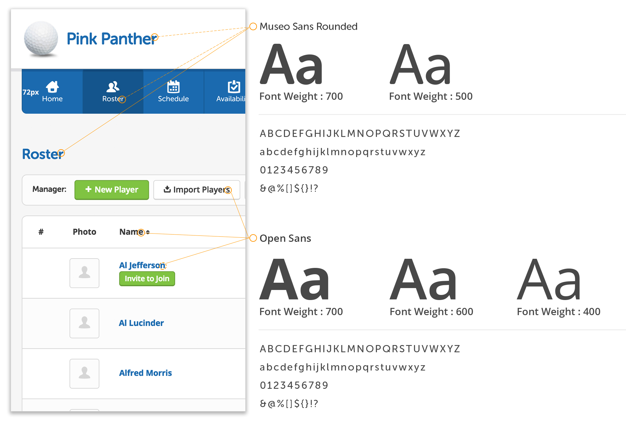
Our primary heading font is Museo Sans Rounded. It is a geometric, highly-legible font. The soft, rounded nature of the type compliments our chosen icon set. Then Open Sans is used primarily for body copy and sub-headings. Open Sans was commissioned by Google, and was developed to have a “neutral, yet friendly appearance” and be “optimized for legibility across print, web, and mobile interfaces.”
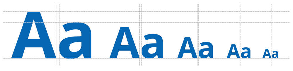
Taking the notion of scaling further with our typography, a modular scale is applied so the way we size and space type all follows a consistent progression. Our modular type scale is 1.125 with a base of 13px, so within the web app every font size progresses either by continually multiplying or dividing by 1.125; a 1/8 increment; line height and letter spacing follows the same pattern See more at modularscale.com
Heading Examples:Lorem ipsum dolor sit amet, consectetur adipiscing elit. Pellentesque ut laoreet dolor. Morbi ac mattis urna. Cras sit amet augue eget sapien cursus elementum ut nec lacus. Sed auctor ullamcorper purus nec egestas. Vivamus et porta arcu. Donec vestibulum in turpis quis consectetur. Aenean dignissim congue magna ut dignissim.
Cras et tristique orci. Mauris sodales dolor ac enim dignissim ullamcorper. Morbi ac facilisis arcu. Pellentesque tempor odio sed faucibus gravida. Praesent eu blandit nisl. Duis nec enim felis. Vestibulum non laoreet nibh. Pellentesque interdum neque tortor.